January 28, 2015
It’s a happening time for museums. The Louvre, the world’s most-visited, drew 9.3 million people in 2013. American museums get more visitors than theme parks and major league ball games combined. In a world of ubiquitous electronic screens, this puts the lie to the notion that we’re growing divorced from the physical world—or so it would seem. In fact, the appeal of museums goes beyond the objects they hold. Their popularity has a lot to do with the way they’re merging the digital and the physical—and shifting their focus from object to experience in the process.
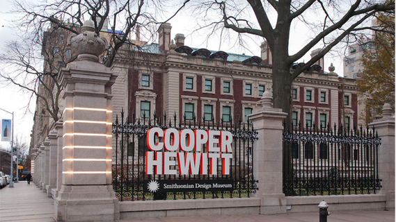
Case in point: New York’s Cooper Hewitt, a branch of the Smithsonian devoted to design, which reopened last November after three years of reinvention. I talked to the key people there for an article in the current issue of The Magazine Antiques, and what I found was a place that had completely rejected the idea of the museum as time capsule. Instead, this new Cooper Hewitt sees itself as something quite different:
“Everything at Cooper Hewitt right now is an experiment,” says Caroline Baumann, the museum’s director since June 2013, as workers were preparing the place for its first regular visitors since she took the job. “Design is all about experimentation. It’s about improving our world. . . . The last thing we want to do is focus on pretty objects. We want to focus on design’s power to change.”
One of the great things about the Cooper Hewitt story, I discovered, is how this ambition echoes that of the museum’s 19th-century founders, Sarah and Eleanor Hewitt. To find out how, please see my story “More Than a Treasure Box.” What I want to do here is talk a bit more about what they’re trying to do—not just updating the museum itself but updating the entire idea of what a museum should be.
The centerpiece of Cooper Hewitt’s reinvention is the digital Pen, an electronic gadget that will be handed out to visitors when they come in and picked up when they leave. Part data storage device, part design implement, the Pen can be used to gather information about the collection, make a downloadable record of your visit, and draw on interactive tabletops made up of ultra-high-definition touchscreens that are big enough for several people to use at once. (For details on how this works, check out the Pen page at Cooper Hewitt. There’s also an excellent article at The Atlantic that explains the technology behind the museum’s makeover.)
The two people most responsible for the Pen are Seb Chan of Cooper Hewitt Labs and Jake Barton of the storytelling and media design firm Local Projects. “Our challenge to Diller Scofidio + Renfro”—the architects who designed the museum installations—”and Local Projects was to give visitors explicit permission to play,” Seb told me. “What would shift people away from just looking? Not another app—that’s not permission to play. That means the museum is about information, not experience. And not the solitary world of the audio guide, either.”
“We designed the Pen to get people to stop looking at their phones,” said Jake. “We wanted them to look at each other, to be creative, to be inspired.” So the Pen, in tandem with the interactive tables, is meant to enhance your visit in another way. It’s a social device, connecting people to the museum and to one another.
Which fits with the emerging definition of museums as a social space. “Museums have always been storehouses of artifacts,” Jake explained. “It used to be that those spaces were just about study and stewardship. But the collection is no longer the goal. It’s a means to an end.”
And the end? Not just individual edification, but immersion, social contact, and story. What used to be the director’s office is now an “Immersion Room” where visitors, instead of looking at swatches from the museum’s wallpaper collection, can digitally project them onto the four surrounding walls. Story is paramount, Jake said, because “if you don’t tell stories around these objects [in the collection], they are quite literally meaningless.” And because we live in an attention economy in which museums need to compete with an explosion of entertainment options, Cooper Hewitt plans to market itself not around individual exhibitions but as a destination with an incredible setting—the turn-of-the-last-century Andrew Carnegie mansion opposite Central Park. It’s about taking advantage, as Jake put it, “of what a museum has—people in a social setting, in physical space, having an authentic and hopefully moving experience.”
The digital Pen is what pulls story and social together.
Seb was brought to Cooper Hewitt by Bill Moggridge, the legendary designer behind the first laptop computer, the 1982 GRiD Compass. Moggridge, a cofounder of the international design firm IDEO, had been named director of Cooper Hewitt in 2010; two years later, at age 69, he died of lung cancer in a San Francisco hospice.
Yet in the short time he had, Moggridge set Cooper Hewitt on its current course. He’d never worked in a museum before. But as he explains in a video that was posted by Cooper Hewitt the day after he died, he thought of his career as falling into three phases: first as a designer, then as a manager of design teams, and finally as a storyteller. It was in heading Cooper Hewitt that he became a storyteller. “Our ambition,” he says, “is to explain design.”
I hope you have a chance to visit.





Comments
Sarah Kershaw
- January 31, 2015
This is interesting and thank you for the post, but part of me cannot help but wonder if the pen is just another distraction, an updated version of those dreary-yet-informative audio guides? Something else standing between the exhibit and the viewer?
Reading this post and your article over on The Magazine Antiques, I feel the interactive wallpaper concept is more successful than the pen. I'd be happy to be wrong on this but I think the wallpaper swatches will work because it quite literally bridges the gap between real and virtual life. I think this is the right direction of travel, that people will like the experience.
Keeping with the immersive theme, as an art lover and a tech-nerd, I've always wanted a program that will situate me in the world of the art, as a character. Imagine, inserting yourself into the work of Vermeer or Holbein et al? Perhaps that's the next step for Google's Art Project, or some groovy little startup.
Jake Barton
- February 1, 2015
You should see it and judge for yourself. If you think the Museum is just about looking at artifacts with no mediation then no media will be acceptable. However, if you think making and looking and researching and creating can all be successfully intertwined, then the pen is what you want as it invites you to both be creative and collect artifacts for inspiration--
Frank Rose
- February 5, 2015
Sarah, I suspect you have a point. But I don't think the problem is with the Pen itself—it's more a question of expectations.
Decades ago, when audioguides were introduced, I'm sure they seemed like a major advance—you could actually tour the Met with Philippe de Montebello speaking into your ear! Now they just seem dreary. The Pen is far more interactive and versatile than the audioguides and the smartphone apps that are supplanting them, but it's not immersive in the way you describe. And if we're ever able to step into a Vermeer, I'm sure the Pen will seem quaint. But it will also be one of the things that helped get us there.
Katherine Barrow
- February 26, 2015
I think perhaps this comment overlooks the museum's context. This is not a standard encyclopaedic museum, with a vast array of exhibits on everything from natural history to art. This is a design focussed space and I think that, by using the pen, the museum is stepping down from the proverbial pedestal and giving visitors permission to participate, and to experience the creation of design first hand. The ability to participate humanises and de-mystifies the process, making it relatable and leading to greater understanding and empathy. Would this work for any museum? No, and I don't think it's intended to. It's a specific solution for a specific space- a way to immerse visitors not only in the end products of the design process, but in the process itself.
Sarah Kershaw
- May 28, 2015
On this theme, this BBC news video explores an artist's attempt to make Van Gogh's The Night Cafe into a 3d experience... http://www.bbc.com/news/technology-32751392